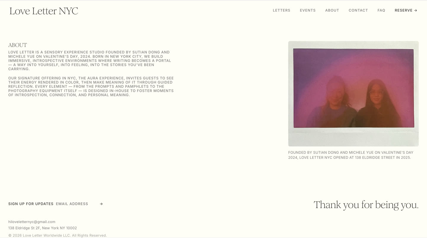
Love Letter is a sensory-experience studio on Manhattan’s Lower East Side (138 Eldridge Street) — founded Valentine’s Day 2024, physical studio opened 2025. Guests see their energy rendered as an aura portrait, then make meaning of it through guided reflective writing: the letter.
It had to feel like the studio — soft, editorial, intimate — while functioning as a storefront: bookable sessions, prices that change, gift cards, and private events. The hard part wasn’t one screen. It was a system where pricing stays truthful and the brand stays consistent across every page and breakpoint.
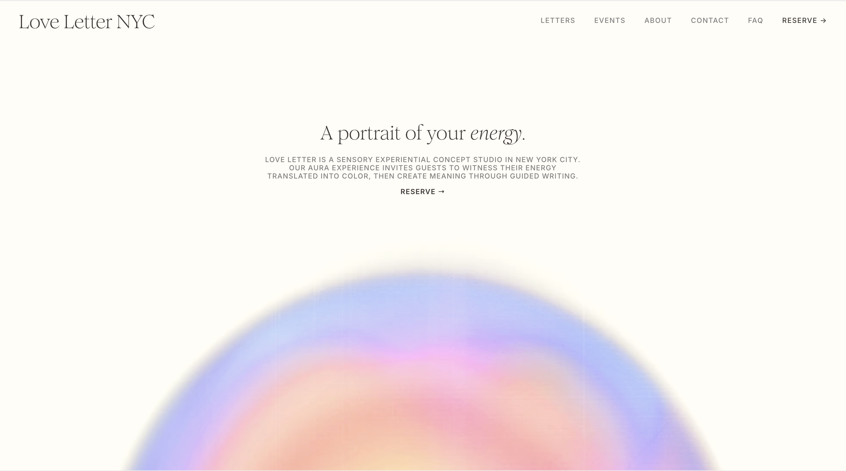
Love Letter photographs a person’s aura as color. I animated that in After Effects — an aura orb that moves and shifts instead of sitting still as a photo.
It ties their aura photography and the letter together in the digital product.
The auras already had their own color key — seven, each with its own name, reading, and gradient. I turned that key into reusable assets in their brand kit, so they can pull the same colors into anything they design down the line.
Romie sets the display headings and Inter does the rest — body, nav, labels, buttons. Warm paper background, two shades of ink, all saved as reusable styles.
Signature interaction — the label rolls up while a hairline underline slides in from the left.
Prices are never hand-typed as the source of truth. Square holds the catalog, a Cloudflare Worker syncs it to the site, and each price binds by item ID — so the page always reflects the studio.
Editable copy lives in each component's property controls, not loose on the canvas. The founders type plain text and it renders in the right style.
Components share the same props across breakpoints, so one edit updates desktop, tablet, and phone at once.
The Events page runs on a CMS collection. The founders add, edit, and reorder events, and the page updates itself.
Contact-form submissions are sorted by type, so general questions, private events, and gift cards each go where they should.