Reflection
What I took away and what I’d do next
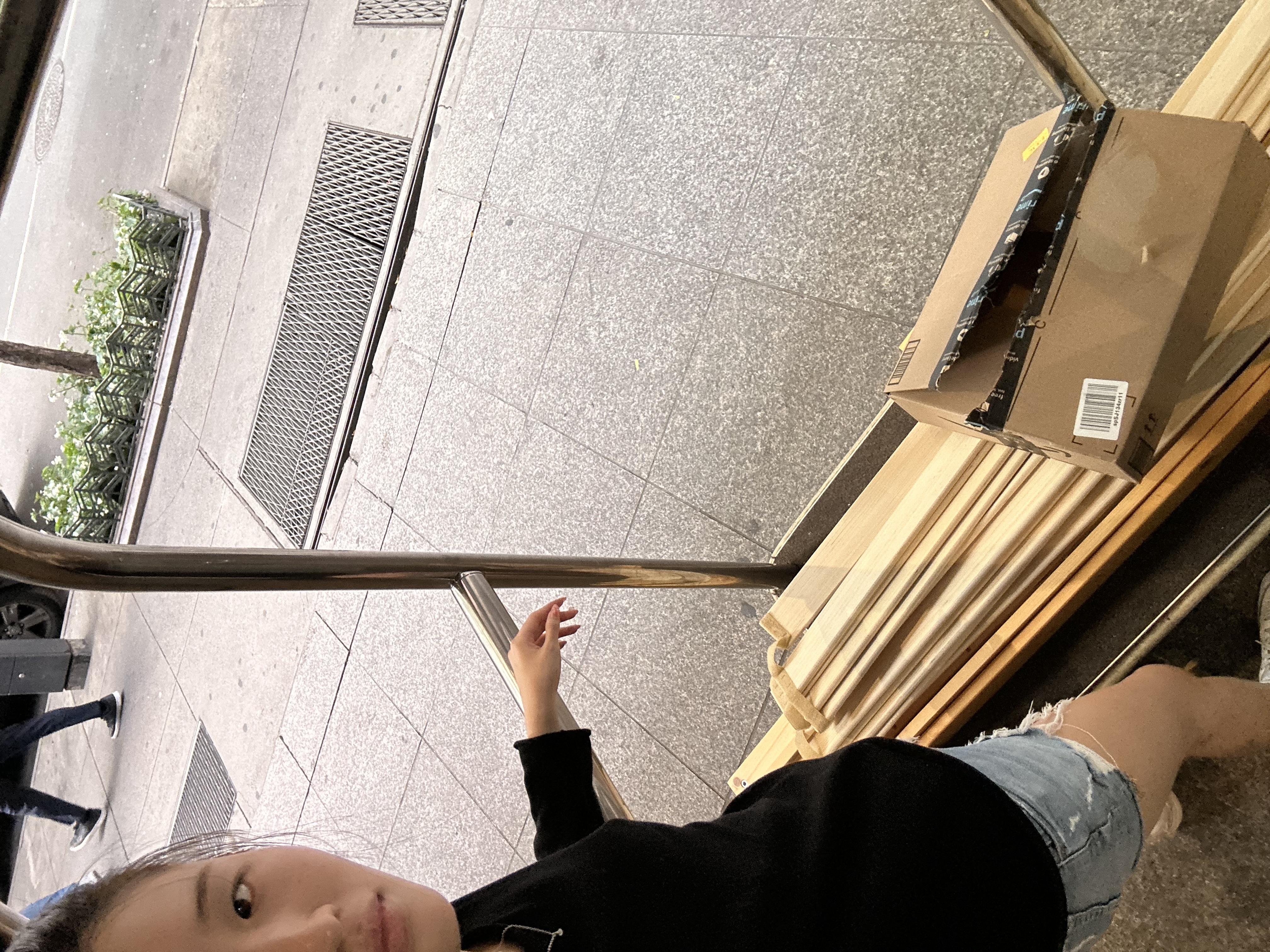
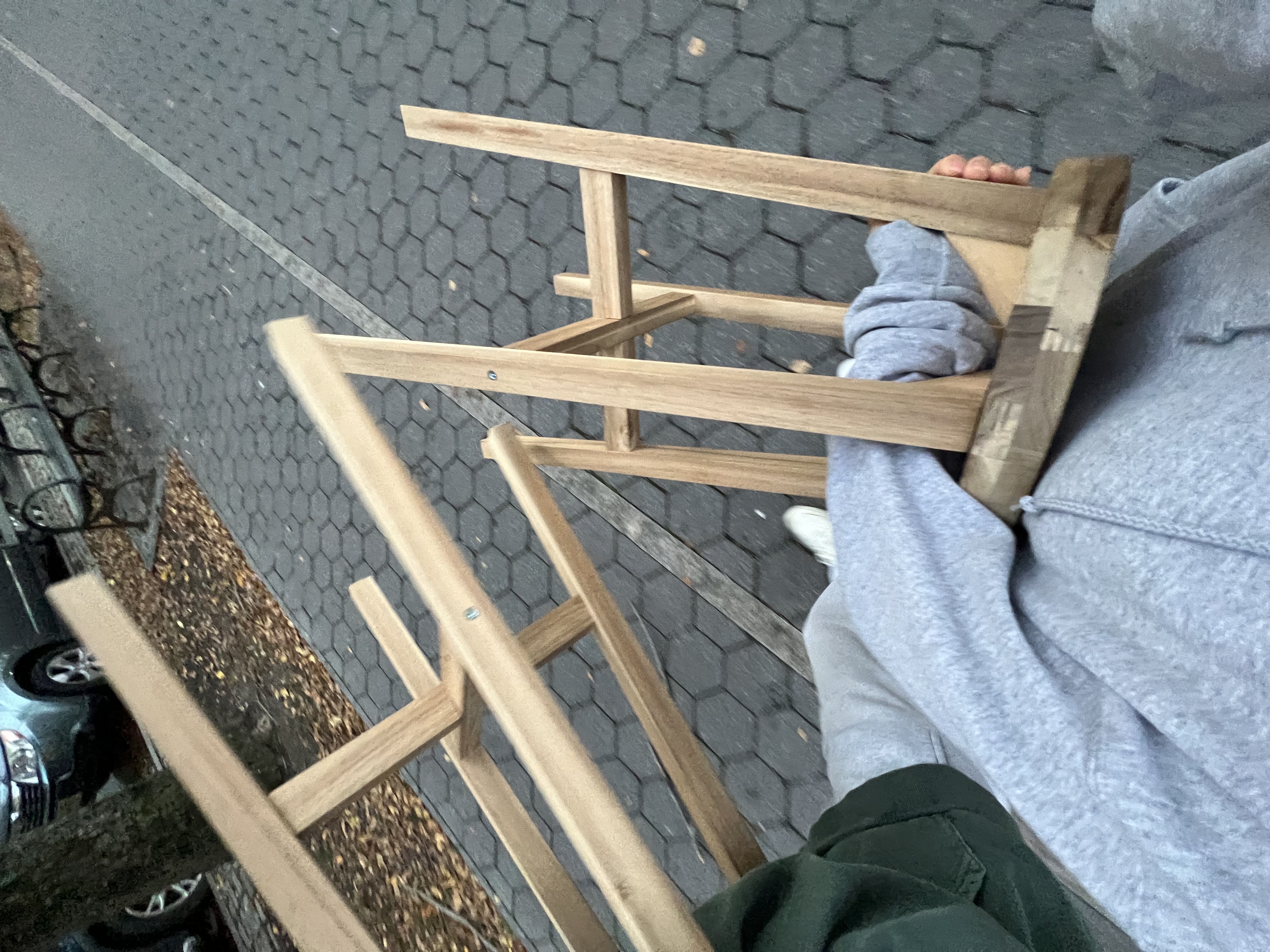
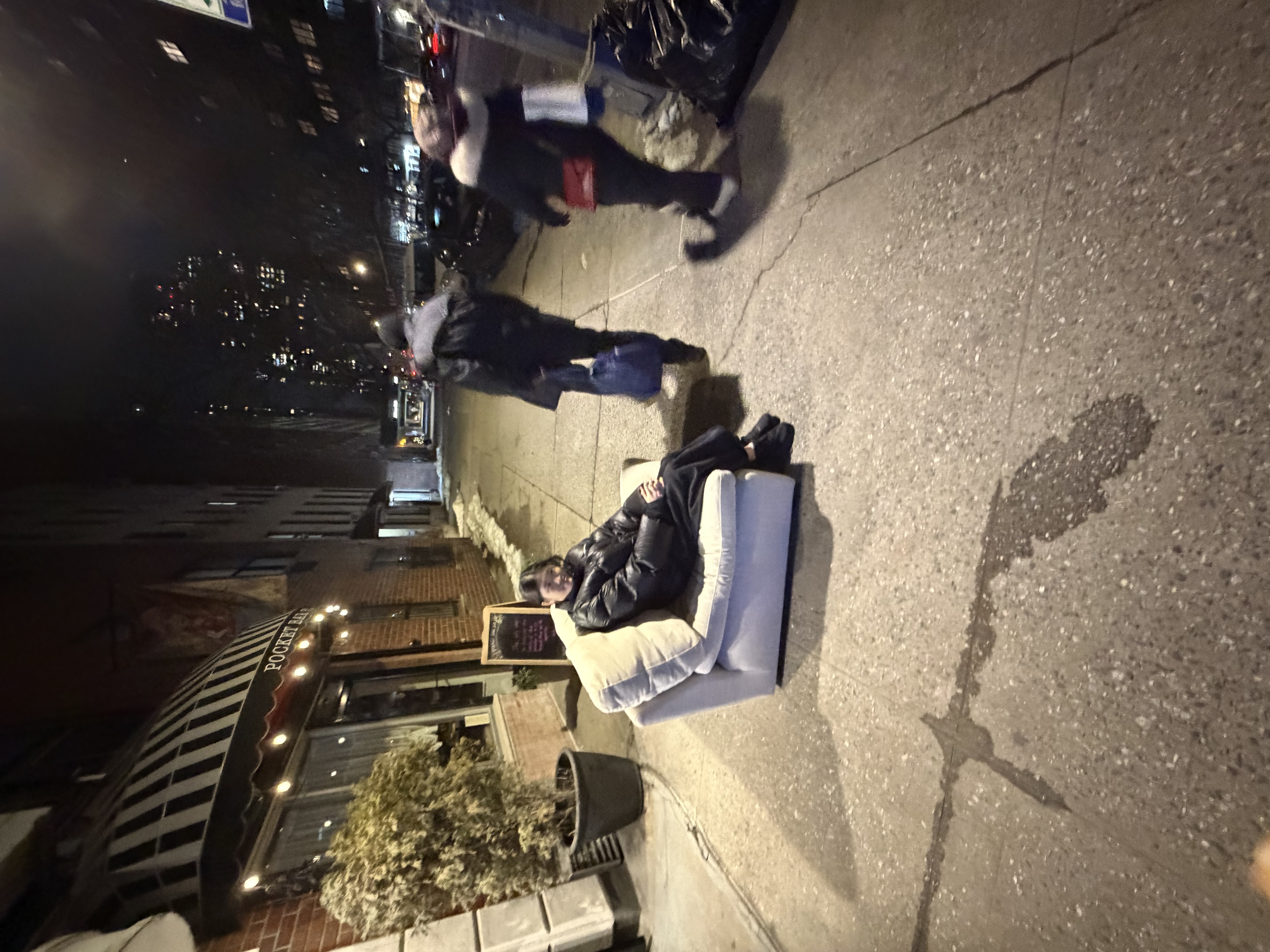
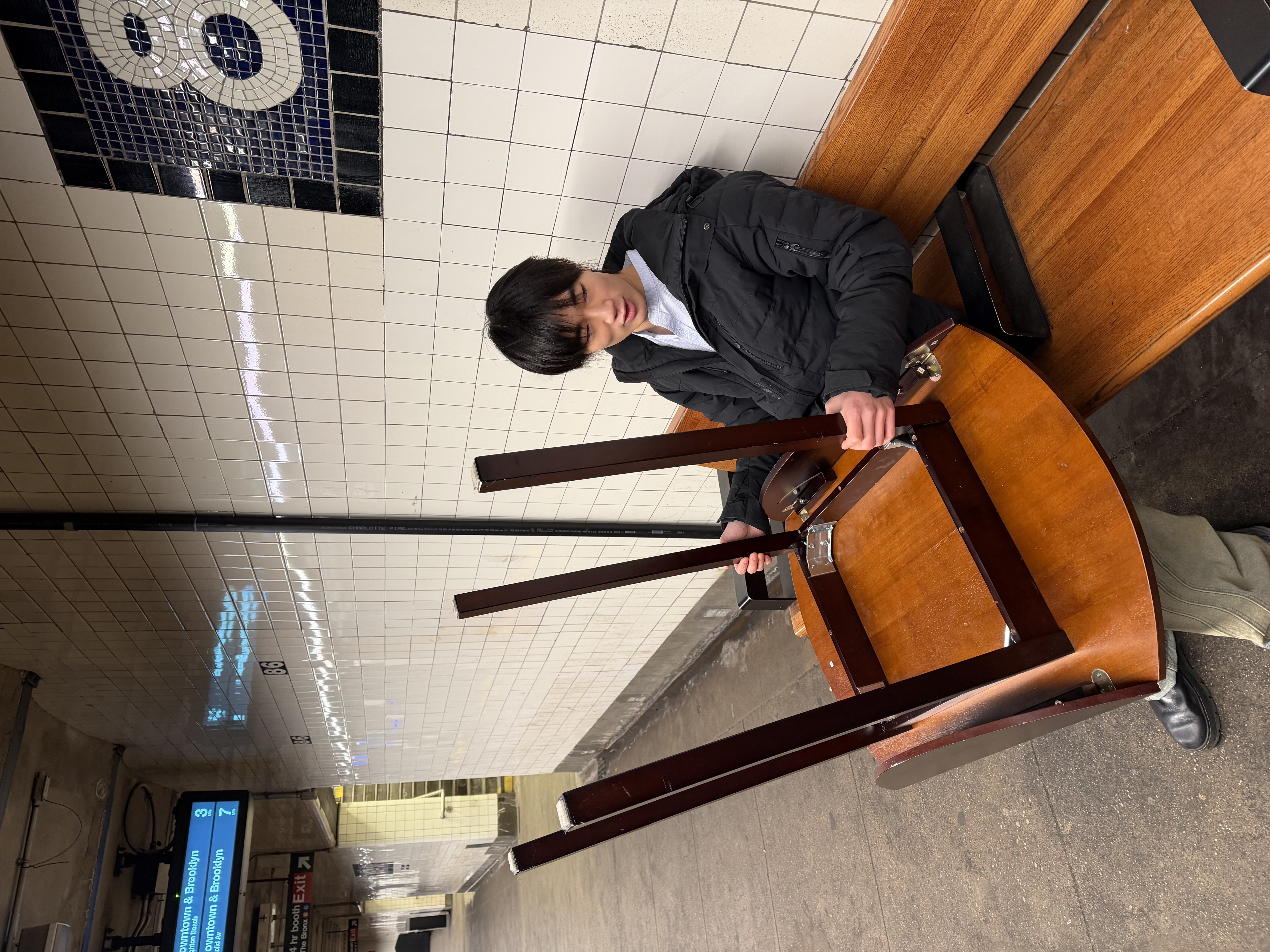
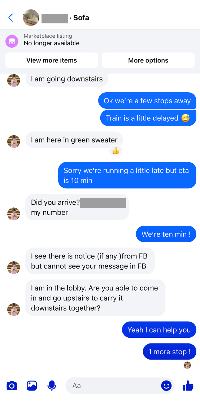
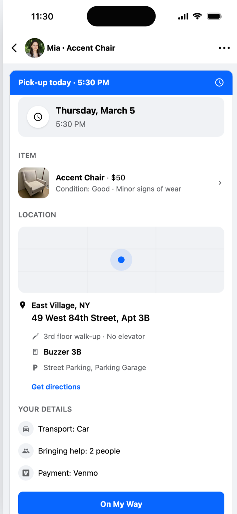
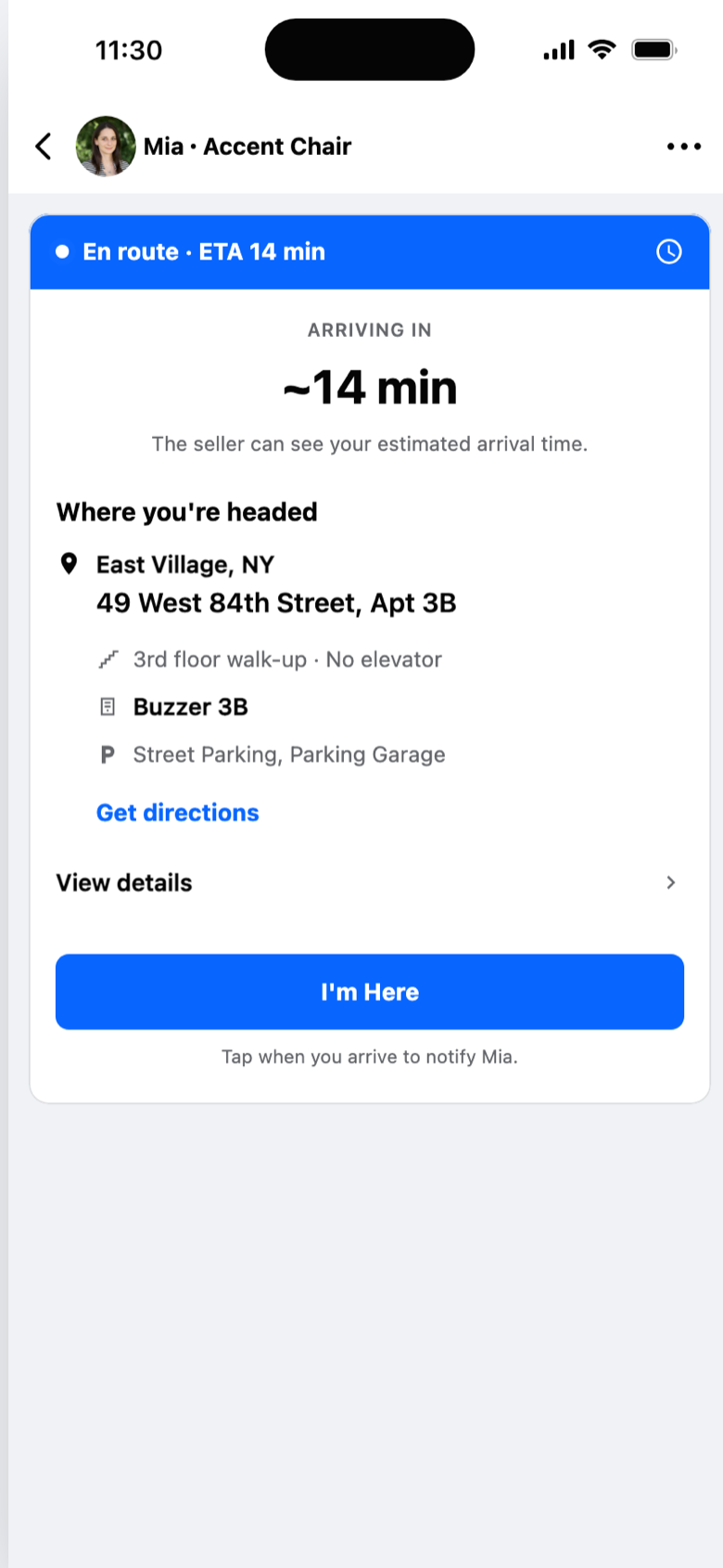
My first instinct was to redesign everything that annoyed me. Research narrowed the opportunity to something more specific, and once the scope was tied to evidence, the decisions became easier to defend on their own terms. The platform treats a pair of AirPods and a sectional sofa the same way. Recognizing the physical reality of what people are buying (weight, size, stairs) shaped most of the decisions here.
I spent more time on the reasoning behind each screen than on the screens themselves. Why this field exists, why the button says “Reserve” instead of “Buy Now,” why edits freeze at 12 hours.
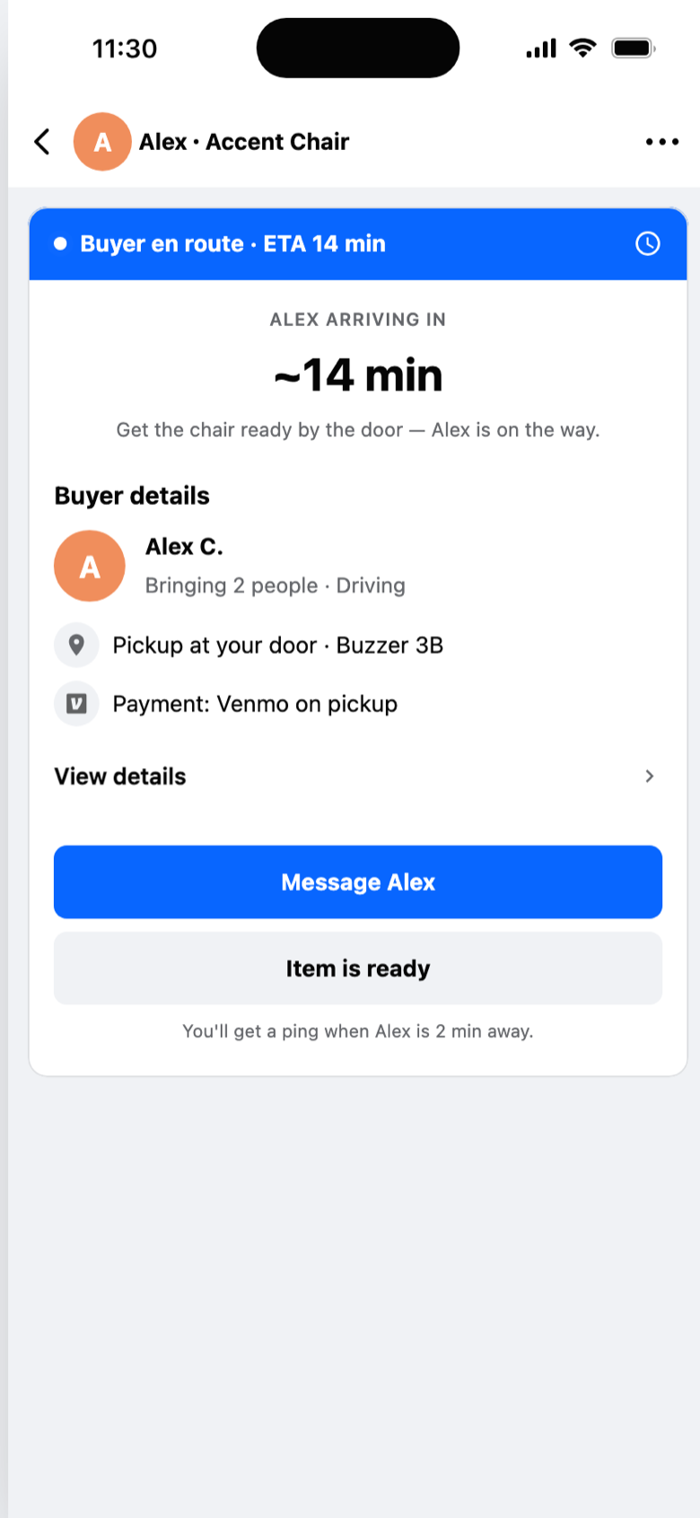
Next, I’d test the seller’s experience. The redesign asks sellers for structured information (dimensions, access, condition), which is more effort than the current “take a photo and post.” The hypothesis is that better listings attract more serious buyers and fewer no-shows, but that tradeoff needs real data. I’d also explore what happens after the pickup: how behavioral tags like “on time” and “item as described” build into trust signals across transactions.
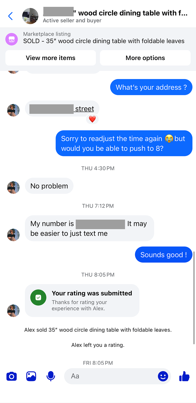
And I’d spend more time with the adoption question. Marketplace works because it’s low-friction to list. Adding structure introduces effort at a moment when the seller just wants to post and move on. The argument for structured coordination is that it reduces the downstream friction (ghosting, no-shows, abandoned conversations) that makes the platform frustrating to use, but that’s a tradeoff worth testing before betting on it.
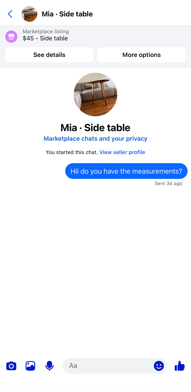
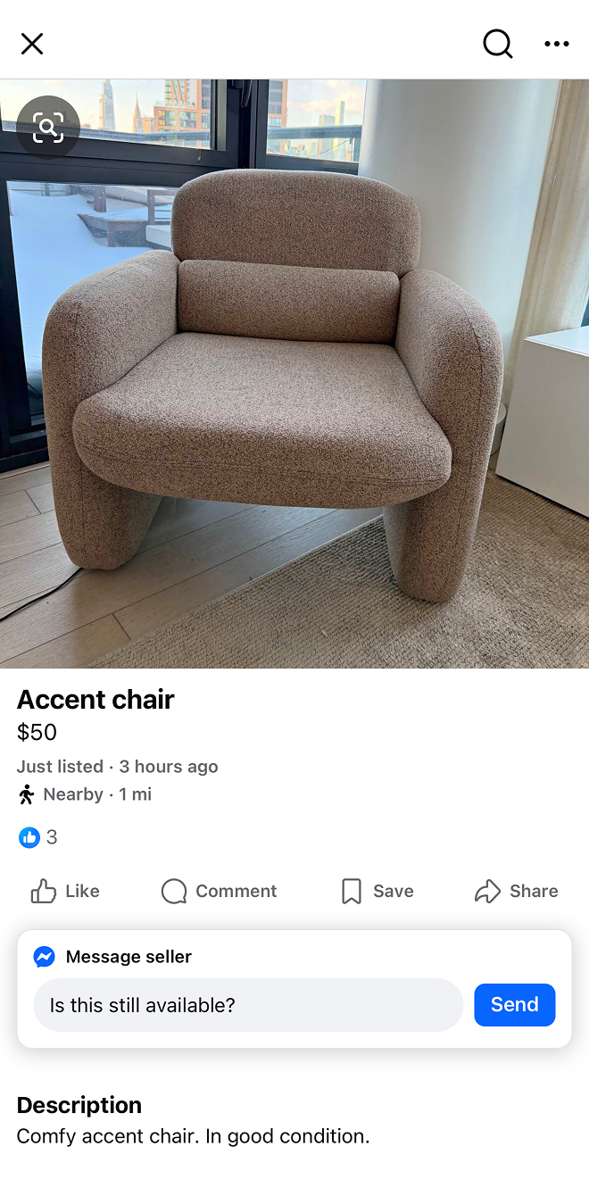
The thing I keep coming back to: this whole redesign leans on richer listings — measurements, access, condition, location — but all of that detail has to come from the seller. I designed most of this from the buyer’s side. With everything I’m now asking a listing to hold, the real question becomes how to make that easy enough that a seller actually fills it in. That’s its own problem, and probably the next one to solve.

 Marketplace